
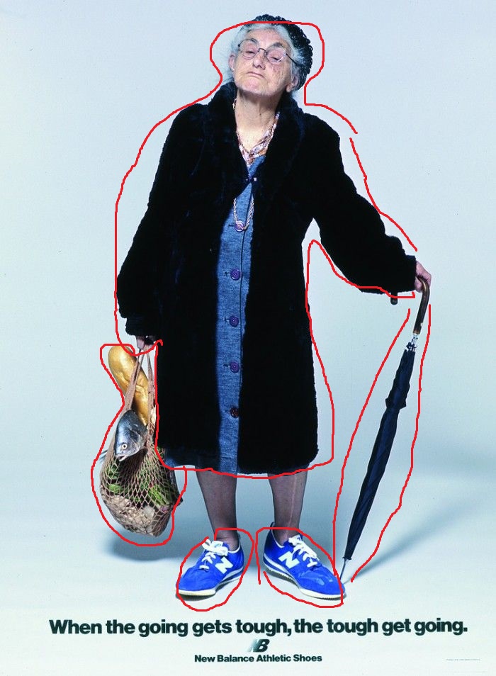
Origin
- From: A vintage shoe/clothing magazine
- Owned: New Balance Athletic, Inc
This image comes from a vintage magazine advertisement for New Balance. The ad depicts and older woman wearing New Balance shoes but it looks like she was grocery shopping and it was raining. This tells us that the shoes are both reliable for walking around and maybe even water resistant to some degree? Also the fact that and older woman is wearing bright blue sneakers, speaks on the possible comfort and or support. I wasn’t able to find the original picture and source its creator.
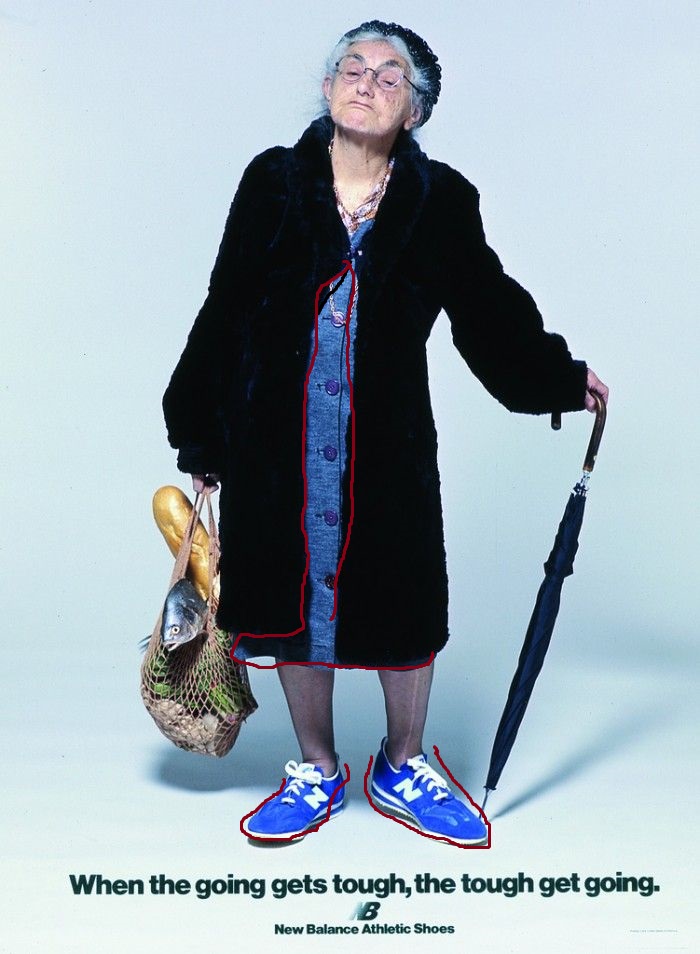
Contrast
Contrast: This image shows a few examples of contrast. The woman is wearing a older style of coat and dress, then down to her feet and its a newer style of sneaker. I think this was to draw the eyes down the woman, going from older style to the “new” shoes that even she would wear. Also, the combination of he bag full of groceries which is stuffed and a little out of control vs the slim, black umbrella. I would also argue that the text shows contrast, the top line is large and much longer vs the smaller showing the company.
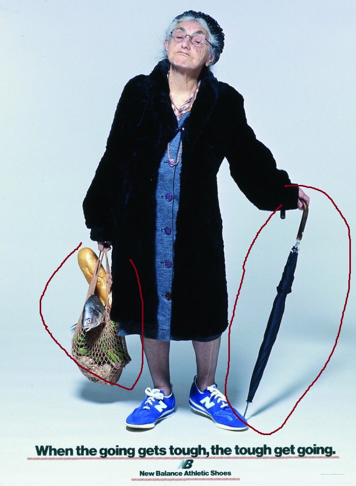
Repetition
Repetition: This image shows repetition in the color usage. The woman is wearing a dress that shares the same or close shade to the shoes color. I believe this is used to draw the eyes down to the main point, the shoes. Also the repetition in the branding on the shoes and bottom text it draws the eyes to one point.
Alignment
Alignment: The alignment in this picture was hard to figure out. The alignment of the bottom text is lined up with the silhouette of the woman’s body. Also the text is on the same alignment making it straight and clean but the woman is a messier layout because she is holding two different sized things and sightly leaning.
Proximity
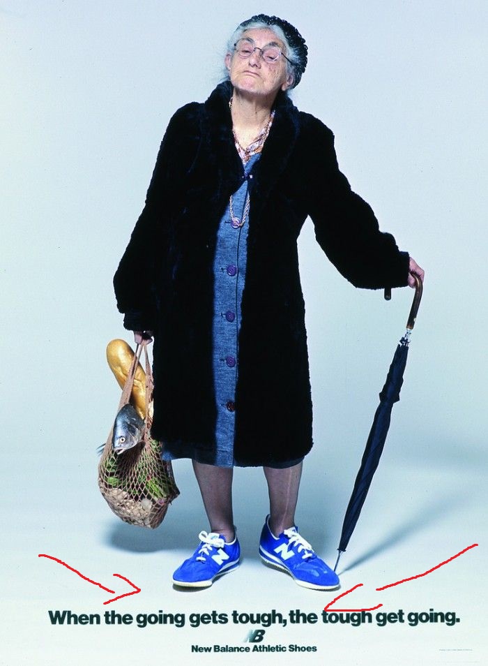
Proximity: The proximity of the shoes to the text creates an importance on the bottom of the image, which contains the point of the ad. The eyes start at the top and work down the woman to see the shoes and information.
Color
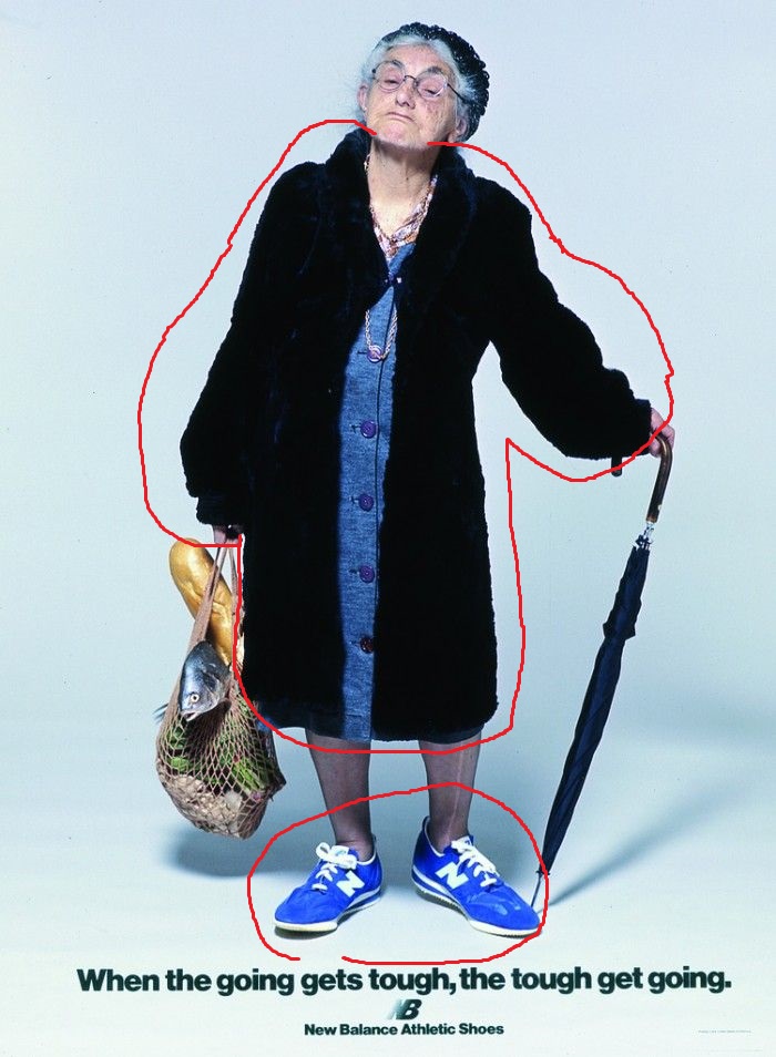
Color: The color in this ad points to two important spots. The dark jacket over the blue dress shows a kind of older style of things as well as negative feeling. The shoes are the blue but with a bright white, showing the newer fresher feel. Also the dark color of her jacket vs the white background keeps your focus on the woman and text.
Conclusion
It is funny how quickly we glance at these kind of images and don’t even know that we are being tricked into seeing what companies want us to see. This image uses contrast, repetition, alignment, proximity, and color to make you look at the shoes. Your eyes work down the image and help you make the conclusion of, “This older lady can use these shoes for every day usage?”. Then you make your own opinions which could range from the shoes must provide support or they look good on her so why not me. It is really impressive how many tricks advertisements use to get us to buy.
