Picture Perfect

A reverse engineering by Brett French

Magazine Cover for Downeast Magazine

The reverse engineering will be focusing on this cover page of one of the editions of Downeast Magazine. Downeast is a Maine based magazine that highlights on all things Maine is known or possibly unknown for. I picked this for my reverse engineering because I live in Maine.

The Meat

The following content will cover the analyzing of Type and Photography methods used in the chosen image.

Categorizing

This cover uses at least two different type sets within it. First in the red (1) This is what is called a script type. They are designed to look hand written and fancy. Second in green (2) we have another version of script type, I would also argue that it is getting close to becoming Slab Serif because of the curling on the letters ends plus its bold. Third in the yellow (3) we see some Sans Serif. The lettering stays the same thickness throughout each letter and there are no curly bits at the ends of each letter.

Contrast

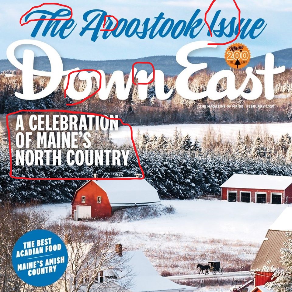
The idea of contrasting items is to create a relationship that produces something nice visually. Here we see the cursive text at the top the page, clearly this is important because it is big and in your face about its style. The lettering curves and looks hand written so it pulls the eyes to see what is written. The text below the title is all caps, straight and slightly serious. This is designed to give the, “Oh, this must be important” feel. I believe they flow nicely together and create a well balanced cover.

Photography

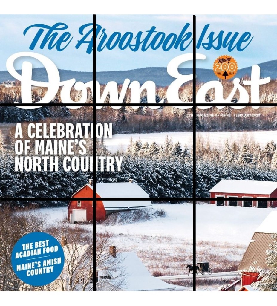
This image uses a technique call rule of thirds. The idea of the rule of thirds is the image is divided into thirds and along the lines (either at the intersection or on the line) is where the content is seen. We can see that the intersections of the lines we see the houses/barn which is a very New England look and we also see the first letters of Down East, the title. Then across the lines we have the tree line that divides the picture up naturally.

Alternate Images

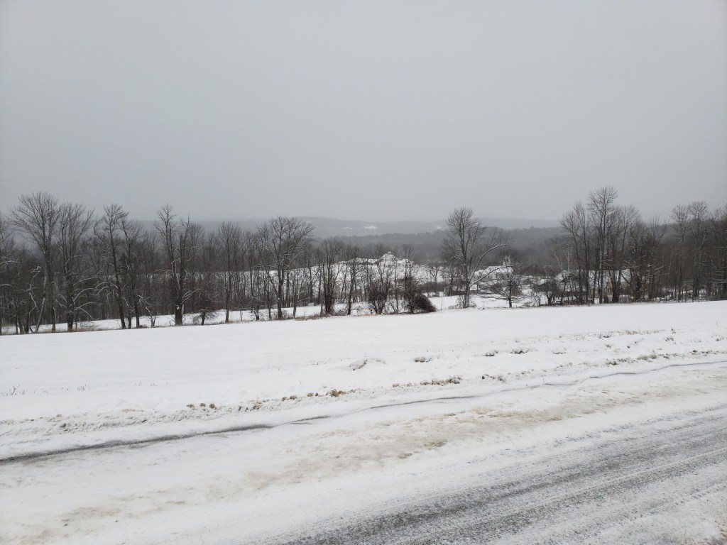
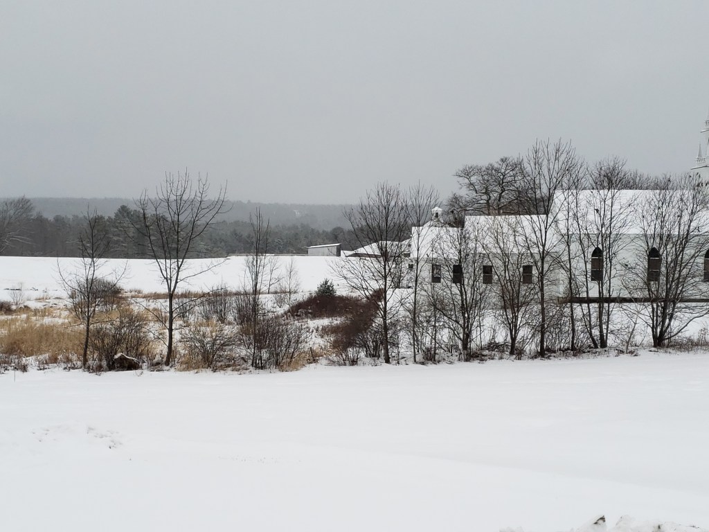
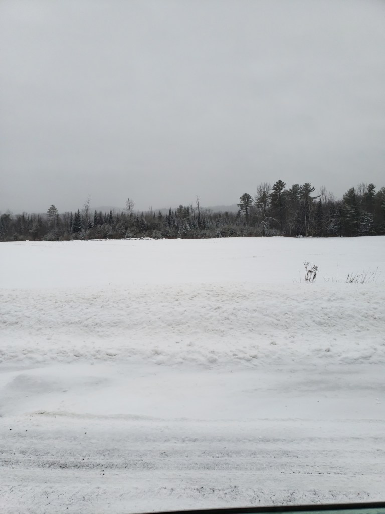
I provided three pictures taken by me (and on the worst day weather wise to take a picture). Each of these pictures I tried to mimic the original photo. Using the tree line to create the natural line, having some building in there that fall into the rule of thirds line and of course snow.

At the end of the day

I have quickly come to realize that design, photography and anything art related is not my strong suite. People who do this for a living or even for fun have so much talent and should get more praise. To be able to take a single image and have it wordlessly say so much to the viewer is crazy. So, in the image I gave we see that the type font is designed to catch the eye. The actually photo is created on a imaginary grid that keeps everything organized but appear natural. These are all secret weapons designed to entice the reader to go deeper.

Tearing It Apart

When the going gets tough, tough gets going ad New Balance
An ad for New Balance

Origin

  • From: A vintage shoe/clothing magazine
  • Owned: New Balance Athletic, Inc

This image comes from a vintage magazine advertisement for New Balance. The ad depicts and older woman wearing New Balance shoes but it looks like she was grocery shopping and it was raining. This tells us that the shoes are both reliable for walking around and maybe even water resistant to some degree? Also the fact that and older woman is wearing bright blue sneakers, speaks on the possible comfort and or support. I wasn’t able to find the original picture and source its creator.

Contrast

Contrast: This image shows a few examples of contrast. The woman is wearing a older style of coat and dress, then down to her feet and its a newer style of sneaker. I think this was to draw the eyes down the woman, going from older style to the “new” shoes that even she would wear. Also, the combination of he bag full of groceries which is stuffed and a little out of control vs the slim, black umbrella. I would also argue that the text shows contrast, the top line is large and much longer vs the smaller showing the company.

Repetition

Repetition: This image shows repetition in the color usage. The woman is wearing a dress that shares the same or close shade to the shoes color. I believe this is used to draw the eyes down to the main point, the shoes. Also the repetition in the branding on the shoes and bottom text it draws the eyes to one point.

Alignment

Alignment: The alignment in this picture was hard to figure out. The alignment of the bottom text is lined up with the silhouette of the woman’s body. Also the text is on the same alignment making it straight and clean but the woman is a messier layout because she is holding two different sized things and sightly leaning.

Proximity

Proximity: The proximity of the shoes to the text creates an importance on the bottom of the image, which contains the point of the ad. The eyes start at the top and work down the woman to see the shoes and information.

Color

Color: The color in this ad points to two important spots. The dark jacket over the blue dress shows a kind of older style of things as well as negative feeling. The shoes are the blue but with a bright white, showing the newer fresher feel. Also the dark color of her jacket vs the white background keeps your focus on the woman and text.

Conclusion

It is funny how quickly we glance at these kind of images and don’t even know that we are being tricked into seeing what companies want us to see. This image uses contrast, repetition, alignment, proximity, and color to make you look at the shoes. Your eyes work down the image and help you make the conclusion of, “This older lady can use these shoes for every day usage?”. Then you make your own opinions which could range from the shoes must provide support or they look good on her so why not me. It is really impressive how many tricks advertisements use to get us to buy.

Design a site like this with WordPress.com
Get started